Project Citiesocial E-commerce app
Year 2016 - 2018
Presented by Citiecoial Ltd.
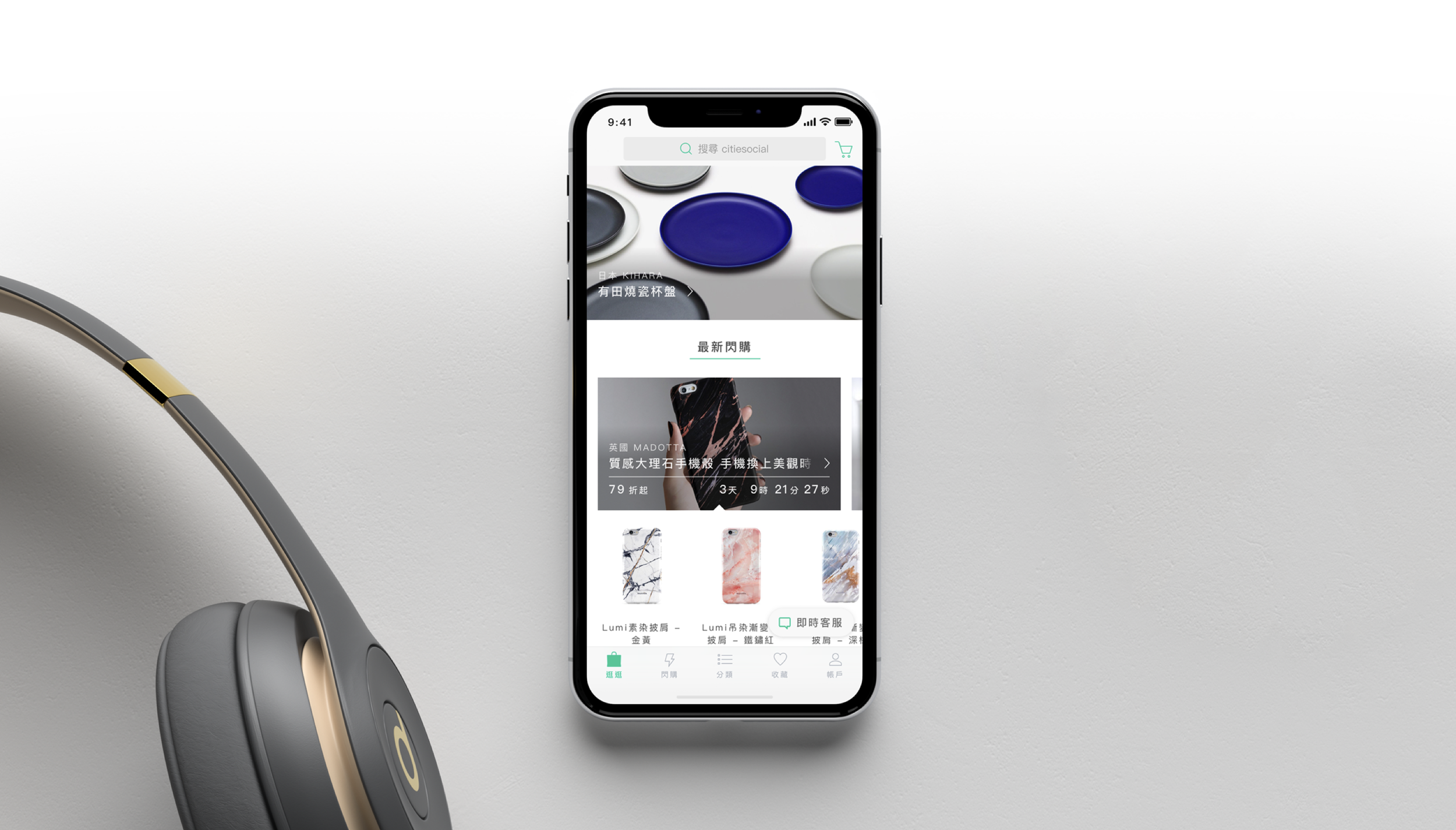
citiesocial is a e-commerce platform for selective items. It features classic, clean design products from all other the world. Therefore the app has to convert the same elegant branding image of citiesocial.
Data-driven design
At citiesocial, every decision has to be based on data. Therefore designers and managers all had to mine data from analytics platforms like Google Analytics. We didn’t only ready the simple number of an item, but dug into each user flow to understand when and why the user made this route.
Simple Stats
Simple stats include click rates, swipe counts, and scroll distance... etc. These numbers are the most direct. When we start a project, we would read these numbers first; and when we review a project’s results, we would also rely on them. While they are pretty direct, they can be misleading.
User Flow
Most of the time, we have to analyse user flows to understand the behaviour. For example, if we only see the drop-off rate from a product’s detail page, it means nothing; but if we cross-analyse it with the users’ sources we can find some insights with those users from EDM and those from the home page.
Survey
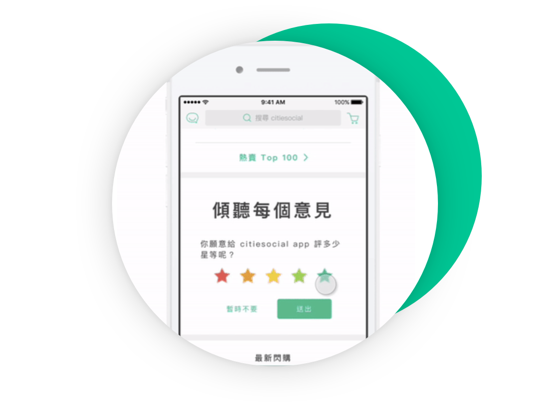
While data is neutral and reliable, you can really ignore the users’ voices. We interview our users or send surveys to collect their opinions and seek improvement from both the users and citiesocial. Sometimes a friendly design doesn’t get you money, but it surely gets you praise.
Project: refund orders
Finding Chance point
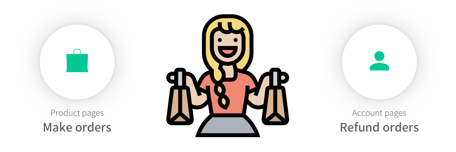
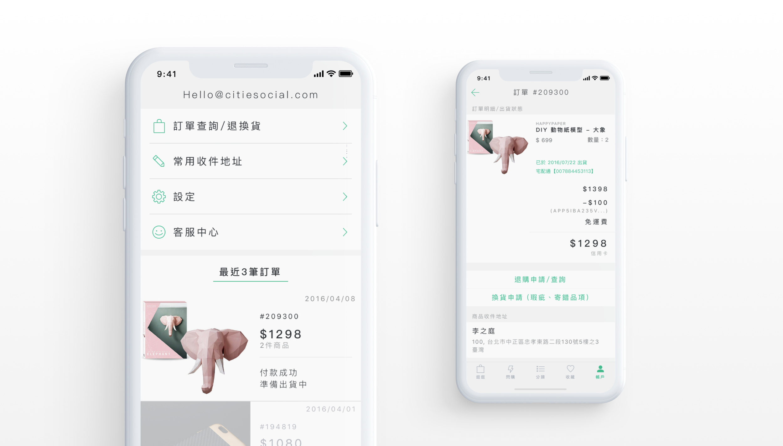
When we were researching the page click rates, we found that a lot of users went to the “account” tab. This tab consists of orders and user settings. We were so curious about why people could go to this tab, so we decided to dig into it. After we analysed the user flows, we realised one important thing: customers who shop online refund their orders quite a lot.
Recreating Flow
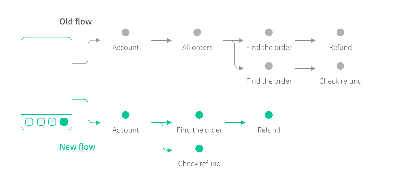
After some discussions with the teams, we realised there was no way to avoid refunds: if a customer wants to refund the product, they would try everything. Therefore we took this as a chance to show our brand’s value. Instead of hiding the feature, we moved “latest orders” to the top level of the account tab, and we made the refund button big and clear. Now its way easier for the users to refund an order.
Clean experience for e-commerce
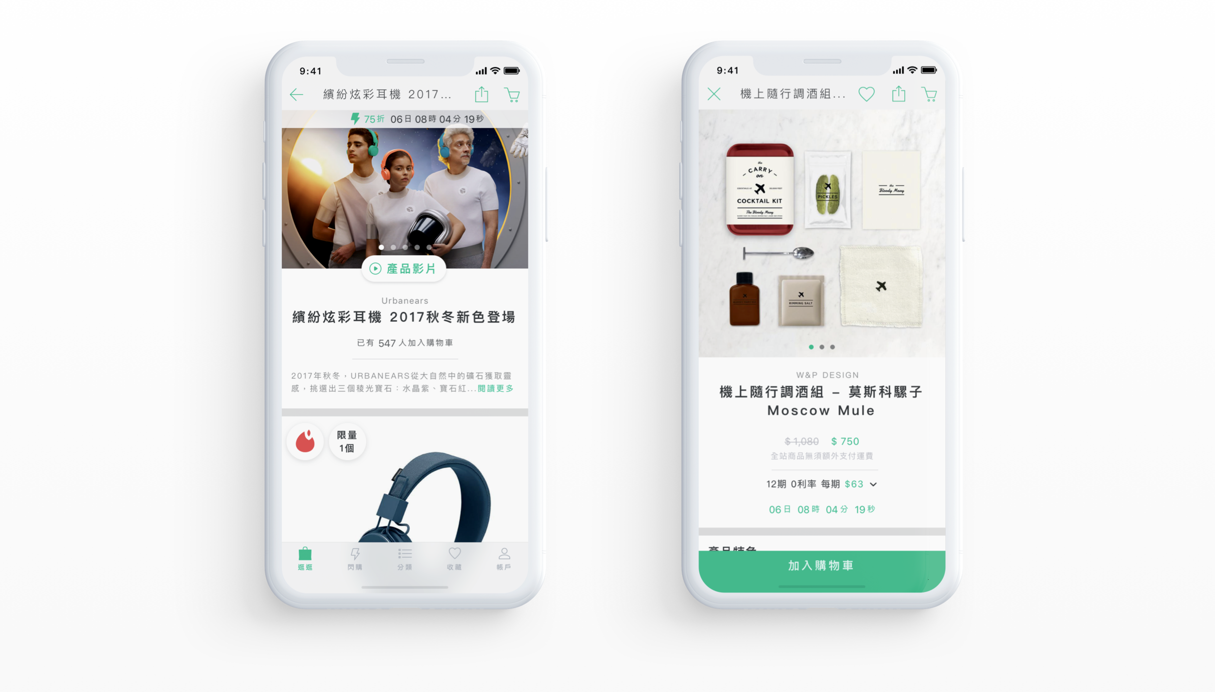
In the e-commerce business, there is a ton of information you want to tell: the price, the sale, the credit card promotion, the installation...ect. There are some ways to solve this issue. One of them is very simple: only show the customer the information when they need it.

